 极客观点
极客观点 项目管理
项目管理 HarmonyOS
初始化和更改屏幕分辨率时,我的光滑滑块宽度错误。
我的脚本:
 $('.slider').slick({
    infinite: false,
    speed: 300,
    initialSlide: 1,
    slidesToShow: 3,
    slidesToScroll: 1,
    dots: false,
    responsive: [{
        breakpoint: 1024,
        settings: {
            slidesToShow: 2
        }
    }, {
        breakpoint: 650,
        settings: {
            initialSlide: 2,
            slidesToShow: 1
        }
    }]
});
我的CSS:
 .sub-slider {
    width: 100%;
    display: flex;
    flex-flow: column;

    .slider {
        display: flex;
        flex-flow: row;
        justify-content: center;
        align-content: center;
        align-items: center;
        min-width:500px;

        .sub-box {
            text-align: center;
            padding-top: 45px;
            cursor:pointer;

            .title {
                color: #6deca0;
                font-family: "AmsiProNarw", sans-serif;
                font-size: 48px;
                font-style: italic;
                font-weight: 800;
            }
            .price {
                color: #393939;
                font-family: "AmsiProNarw", sans-serif;
                font-size: 18px;
                font-style: italic;
                font-weight: 800;
            }
            .sub-slider-btn {
                margin: 60px 20px;
                border-color: #eaeaea!important;
                background-color: #fdfdfd!important;
                color: #686868!important;
            }
        }

        .sub-box:hover {
            transition: border .2s;
            border-bottom: 14px solid #6deca0;
            .sub-slider-btn{
                border-color: #6deca0!important;
                background-color: rgba(108,235,159,.2)!important;
                color: #393939!important;
            }
        }
    }

    .sub-slider-confirmation-btn-wrp {
        align-self: center;
        display: none;
        .sub-slider-confirmation-btn {
            cursor:pointer;
            $margin: 20px;
            $height: 45px;
            height: $height;
            width: 80px;
            border: 1px solid #ccc;
            border-radius: 8px;
            margin: $margin $margin $margin $margin;
            text-align: center;
            line-height: $height;
            font-weight: 800;
        }
    }

}
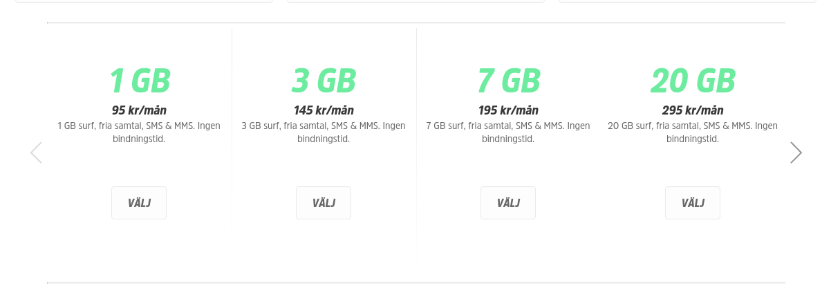
这就是它的加载方式,即使我指定 slidesToShow: 3 。
然后,当我更改为响应式时,它看起来像这样: 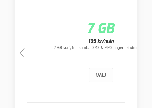
我不确定如何解决这个问题。我已经阅读了这些内容,但没有解决:
https://github.com/kenwheeler/slick/issues/790
https://github.com/kenwheeler/slick/issues/1180
https://github.com/kenwheeler/slick/issues/2167
编辑:
我做了一个小提琴 https://jsfiddle.net/simeydotme/fmo50w7n/
它似乎在小提琴中起作用,但在我的网站上不起作用。也许我继承了一些糟糕的 CSS?但我现在已经尝试调试 5 小时了。而且我找不到任何解决方案..
原文由 mrfr 发布,翻译遵循 CC BY-SA 4.0 许可协议
我也遇到了同样的问题 - 滑块轨道宽度超过 30,000 像素。阅读 Spencer Rysman 的回答后,我查看了我的标记并意识到我已经将
row类应用到包装我的滑块的 div 并且因为我使用的是 bootstrap 4 默认值display:flex使用的属性行类导致幻灯片元素出现意外输出。在包装行 div 中添加一个 col 为我解决了这个问题。
虽然,这可能与 op 的问题没有直接关系,但我想我会发帖,因为其他用户可能会遇到与我类似的问题并找到此线程。