 极客观点
极客观点 项目管理
项目管理 HarmonyOS
我有一个列表,其中包含具有自动宽度的不同项目(在我的情况下不能给出固定宽度)。我使用 justify-content: space-between 因为我的第一个项目必须从容器的开头开始,最后一个项目必须在容器的结尾。
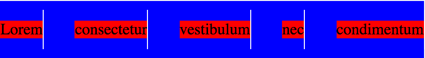
以上所有工作正常,但每当我尝试在这些列表项之间添加一行时,问题就开始出现了。我无法确定我必须放置这些线的像素数或百分比。有没有办法“动态”定位不同列表项之间的线条?
我们使用的 html 是不可编辑的,因为它是由我们使用的 CMS 呈现的。
这就是我所拥有的:
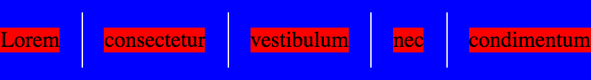
这就是我想要达到的目标
这是我目前拥有的代码
 html {
    box-sizing: border-box;
}

.Container {
    max-width: 70%;
    margin-right: auto;
    margin-left: auto;
    background: blue;
    padding-top: 20px;
    padding-bottom: 20px;
}

.Flex {
    display: flex;
    flex-flow: row wrap;
    justify-content: space-between;
    list-style: none;
    margin: 0;
    padding: 0;
}

.Flex-item {
    background: red;
    position: relative;
}

.Flex-item:after {
    content: "";
    position: absolute;
    background: white;
    width: 1px;
    height: 40px;
    top: 50%;
    transform: translateY(-50%);
}
 <div class="Container">
    <ul class="Flex">
         <li class="Flex-item">Lorem</li>
         <li class="Flex-item">consectetur</li>
         <li class="Flex-item">vestibulum</li>
         <li class="Flex-item">nec</li>
         <li class="Flex-item">condimentum</li>
    </ul>
</div>
原文由 Nicholas 发布,翻译遵循 CC BY-SA 4.0 许可协议
我在我正在进行的项目中使用此解决方案。
它在 flex 容器上设置
justify-content: space-between;flex: 1 1 auto;在子容器上设置 —,除了第一个,所有子容器都有左边框。我修改了您的示例 CSS,以便您查看。我不确定你是否要为孩子们设置背景颜色,所以我只是使用 line-height 来获得更大的边框。
不修改 HTML。