CSS 网格布局:如何使背景颜色跨越多个单元格?

新手上路,请多包涵

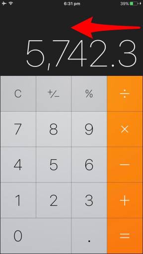
对于 FreeCodeCamp 作业,我正在 CSS 网格布局中制作一个 iOS 计算器克隆。运行它的 JavaScript 供以后使用;我现在专注于设计。

最终结果应如下所示:

在此处输入图像描述

 html {
  font-size: 20px;
}

.wrapper {
  display: grid;
  grid-template-columns: 1.2fr 1fr 1.2fr;
  grid-auto-rows: minmax(700px, auto);
}

.wrapper>div {
  padding: 0;
}

.nested-1 {
  display: grid;
  grid-template-columns: repeat(3, 1fr);
  justify-items: center;
}

.nested-1>div {
  font-family: "Roboto", sans-serif;
  font-size: 0.6rem;
  color: white;
}

.top-bar {
  padding-top: 0.3rem;
}

.flight-modus {
  justify-self: start;
  padding-left: 0.3rem;
}

.charge-status {
  justify-self: end;
  padding-right: 0.3rem;
}

.nested-2 {
  display: grid;
  grid-auto-rows: minmax(200px, auto);
  justify-items: end;
}

.nested-2>div {
  font-family: "Roboto", sans-serif;
  font-size: 5rem;
  font-weight: lighter;
  color: white;
  padding-left: 0.2rem;
  padding-right: 0.2rem;
  align-self: end;
}

.nested-3 {
  display: grid;
  grid-template-columns: repeat(4, 1fr);
  grid-template-rows: repeat(5, 1fr);
  justify-items: center;
  font-size: 2.2rem;
  color: black;
  background: #ddd;
  font-family: "Roboto", sans-serif;
  font-weight: lighter;
  padding: 1rem;
}

.operations {
  font-size: 1.5rem;
  padding: 1.3rem;
}

.bg-grey {
  background: #ccc;
}

.left-cell {
  background: black;
}

.right-cell {
  background: black;
}

.calculator {
  background: #333333;
}
 <body class="">
  <div class="wrapper">
    <div class="left-cell">
    </div>

    <div class="calculator">
      <div class="nested-1 top-bar">
        <div class="flight-modus"><img src="http://i63.tinypic.com/sebv9j.png" alt="flight mode"> &nbsp;
          <img src="http://i67.tinypic.com/5zqf4k.png" alt="wifi signal at full strength"></div>
        <div>10:10 am</div>
        <div class="charge-status">96% <img src="http://i67.tinypic.com/30ldxtx.png" alt="battery at near full charge"></div>
      </div>

      <div class="nested-2 result">
        <div>3,658.8</div>
      </div>

      <div class="nested-3 keys">
        <div class="operations bg-grey">C</div>
        <div class="operations bg-grey">+/-</div>
        <div class="operations bg-grey">%</div>
        <div class="operations bg-grey">/</div>
        <div>5</div>
        <div>5</div>
        <div>5</div>
        <div>5</div>
        <div>5</div>
        <div>5</div>
        <div>5</div>
        <div>5</div>
        <div>5</div>
        <div>5</div>
        <div>5</div>
        <div>5</div>
        <div>5</div>
        <div>5</div>
        <div>5</div>
        <div>5</div>
      </div>

    </div>
    <div class="right-cell">
    </div>
  </div>

我做了什么:

我制作了一个包含多个嵌套网格的通用网格。这些嵌套网格中的第 3 个必须容纳计算器键(数字 0-9、基本数学运算、结果、清除)。

我如何设置一个连续的 background-color 跨越一定数量的 cells 例如深灰色,橙色等?现在,在我的个人 divs bg 留下了空白。接下来, cell-borders 也应该按照示例获得 1px 纯色。

在 SO 和 CSS Grid layout / CSS Flexbox 教程中四处搜索之后,我找不到一个简单的解决方案来解决这个明显简单的任务。我应该在这里将 Flexbox 引入我的网格吗?

尽管我很欣赏 Grid 带来的美妙的新动态,以及它与 Flexbox 的兼容性,但我对这两者还是很陌生。

欢迎对我的代码结构提出任何提示和评论!谢谢,克里斯

原文由 Juchtmans Chris 发布,翻译遵循 CC BY-SA 4.0 许可协议

阅读 310
2 个回答
  1. 修复 nested-3 的边框和背景,您可以使用以下方法设置背景和边框:
    background: #888;
   grid-gap: 1px;

对于 nested-3 的所有 _孩子_,您可以设置背景:

    .nested-3 > div {
     background: #ddd;
   }

  1. 而不是 padding.operations 你可以将它添加到 nested-3 > div
    .nested-3 > div {/* ADDED */
     background: #ddd;
     display: flex;
     justify-content: center;
     align-items: center;
     padding: 1.3rem;
   }

并且您可能必须从 nested-3 div 中删除 justify-items: centerpadding: 1rem

我也尝试了这个设计——像这样重新排列标记:

 <div class="nested-3 keys">
    <!-- MODIFIED HERE -->
    <div class="operations bg-grey">C</div>
    <div class="operations bg-grey">+/-</div>
    <div class="operations bg-grey">%</div>
    <div>7</div>
    <div>8</div>
    <div>9</div>
    <div>4</div>
    <div>5</div>
    <div>6</div>
    <div>1</div>
    <div>2</div>
    <div>3</div>
    <div class="zero">0</div>
    <div>.</div>
    <div class="operations bg-grey op-right">/</div>
    <div class="op-right">x</div>
    <div class="op-right">-</div>
    <div class="op-right">+</div>
    <div class="op-right">=</div>
</div>

并添加了这些样式:

 .nested-3>.op-right {
  grid-column-start: 4;
  grid-row-start: 1;
  background: #fd8a0d;
}

.nested-3>.op-right+.op-right {
  grid-row-start: 2;
}

.nested-3>.op-right+.op-right+.op-right {
  grid-row-start: 3;
}

.nested-3>.op-right+.op-right+.op-right+.op-right {
  grid-row-start: 4;
}

.nested-3>.op-right+.op-right+.op-right+.op-right+.op-right {
  grid-row-start: 5;
}

.zero {
  grid-column: span 2;
}

请参阅下面的代码段:

 html {
  font-size: 20px;
}

.wrapper {
  display: grid;
  grid-template-columns: 1.2fr 1fr 1.2fr;
  grid-auto-rows: minmax(700px, auto);
}

.wrapper>div {
  padding: 0;
}

.nested-1 {
  display: grid;
  grid-template-columns: repeat(3, 1fr);
  justify-items: center;
}

.nested-1>div {
  font-family: "Roboto", sans-serif;
  font-size: 0.6rem;
  color: white;
}

.top-bar {
  padding-top: 0.3rem;
}

.flight-modus {
  justify-self: start;
  padding-left: 0.3rem;
}

.charge-status {
  justify-self: end;
  padding-right: 0.3rem;
}

.nested-2 {
  display: grid;
  grid-auto-rows: minmax(200px, auto);
  justify-items: end;
}

.nested-2>div {
  font-family: "Roboto", sans-serif;
  font-size: 5rem;
  font-weight: lighter;
  color: white;
  padding-left: 0.2rem;
  padding-right: 0.2rem;
  align-self: end;
}

.nested-3 {
  display: grid;
  grid-template-columns: repeat(4, 1fr);
  grid-template-rows: repeat(5, 1fr);
  /*justify-items: center;*/
  font-size: 2.2rem;
  color: black;
  background: #888;/* CHANGED */
  grid-gap: 1px;/* ADDED */
  font-family: "Roboto", sans-serif;
  font-weight: lighter;
  /*padding: 1rem;*/
}

.nested-3>div { /* ADDED */
  background: #ddd;
  display: flex;
  justify-content: center;
  align-items: center;
  padding: 1.3rem;
}

.operations {
  font-size: 1.5rem;
  /*padding: 1.3rem;*/
}

.bg-grey {
  background: #ccc;
}

.left-cell {
  background: black;
}

.right-cell {
  background: black;
}

.calculator {
  background: #333333;
}

/* ADDED THESE BELOW */

.nested-3>.op-right {
  grid-column-start: 4;
  grid-row-start: 1;
  background: #fd8a0d;
}

.nested-3>.op-right+.op-right {
  grid-row-start: 2;
}

.nested-3>.op-right+.op-right+.op-right {
  grid-row-start: 3;
}

.nested-3>.op-right+.op-right+.op-right+.op-right {
  grid-row-start: 4;
}

.nested-3>.op-right+.op-right+.op-right+.op-right+.op-right {
  grid-row-start: 5;
}

.zero {
  grid-column: span 2;
}
 <body class="">
  <div class="wrapper">
    <div class="left-cell">
    </div>

    <div class="calculator">
      <div class="nested-1 top-bar">
        <div class="flight-modus"><img src="http://i63.tinypic.com/sebv9j.png" alt="flight mode"> &nbsp;
          <img src="http://i67.tinypic.com/5zqf4k.png" alt="wifi signal at full strength"></div>
        <div>10:10 am</div>
        <div class="charge-status">96% <img src="http://i67.tinypic.com/30ldxtx.png" alt="battery at near full charge"></div>
      </div>

      <div class="nested-2 result">
        <div>3,658.8</div>
      </div>

      <div class="nested-3 keys">
        <!-- MODIFIED HERE -->
        <div class="operations bg-grey">C</div>
        <div class="operations bg-grey">+/-</div>
        <div class="operations bg-grey">%</div>
        <div>7</div>
        <div>8</div>
        <div>9</div>
        <div>4</div>
        <div>5</div>
        <div>6</div>
        <div>1</div>
        <div>2</div>
        <div>3</div>
        <div class="zero">0</div>
        <div>.</div>
        <div class="operations bg-grey op-right">/</div>
        <div class="op-right">x</div>
        <div class="op-right">-</div>
        <div class="op-right">+</div>
        <div class="op-right">=</div>
      </div>

    </div>
    <div class="right-cell">
    </div>
  </div>

原文由 kukkuz 发布,翻译遵循 CC BY-SA 3.0 许可协议

瓷砖边框

制作黑色边框的一种简单方法是为容器提供黑色背景色。

 .nested-3 {
  background: black;
}

然后将前景色应用于每个键。

 .nested-3 > div {
  background: #ddd;
  display: flex;
  align-items: center;
  justify-content: center;
}

(使用 flexbox 使内容居中。)

然后使用 grid-gap 属性创建小间距,模拟边框。

 .nested-3 {
  grid-gap: 1px;
}

jsFiddle 演示

 html {
  font-size: 20px;
}

.wrapper {
  display: grid;
  grid-template-columns: 1.2fr 1fr 1.2fr;
  grid-auto-rows: minmax(700px, auto);
}

.wrapper>div {
  padding: 0;
}

.nested-1 {
  display: grid;
  grid-template-columns: repeat(3, 1fr);
  justify-items: center;
}

.nested-1>div {
  font-family: "Roboto", sans-serif;
  font-size: 0.6rem;
  color: white;
}

.top-bar {
  padding-top: 0.3rem;
}

.flight-modus {
  justify-self: start;
  padding-left: 0.3rem;
}

.charge-status {
  justify-self: end;
  padding-right: 0.3rem;
}

.nested-2 {
  display: grid;
  grid-auto-rows: minmax(200px, auto);
  justify-items: end;
}

.nested-2>div {
  font-family: "Roboto", sans-serif;
  font-size: 5rem;
  font-weight: lighter;
  color: white;
  padding-left: 0.2rem;
  padding-right: 0.2rem;
  align-self: end;
}

.nested-3 {
  display: grid;
  grid-template-columns: repeat(4, 1fr);
  grid-template-rows: repeat(5, 1fr);
  /* justify-items: center; */
  text-align: center;
  font-size: 2.2rem;
  color: black;
  background: black;
  font-family: "Roboto", sans-serif;
  font-weight: lighter;
  padding: 1rem;
  grid-gap: 1px;
}

.nested-3>* {
  background: #ddd;
  display: flex;
  align-items: center;
  justify-content: center;
}

.operations {
  font-size: 1.5rem;
  padding: 1.3rem;
}

.left-cell {
  background: black;
}

.right-cell {
  background: black;
}

.calculator {
  background: #333333;
}
 <div class="wrapper">
  <div class="left-cell">
  </div>

  <div class="calculator">
    <div class="nested-1 top-bar">
      <div class="flight-modus"><img src="http://i63.tinypic.com/sebv9j.png" alt="flight mode"> &nbsp;
        <img src="http://i67.tinypic.com/5zqf4k.png" alt="wifi signal at full strength"></div>
      <div>10:10 am</div>
      <div class="charge-status">96% <img src="http://i67.tinypic.com/30ldxtx.png" alt="battery at near full charge"></div>
    </div>

    <div class="nested-2 result">
      <div>3,658.8</div>
    </div>

    <div class="nested-3 keys">
      <div class="operations">C</div>
      <div class="operations">+/-</div>
      <div class="operations">%</div>
      <div class="operations">/</div>
      <div>5</div>
      <div>5</div>
      <div>5</div>
      <div>5</div>
      <div>5</div>
      <div>5</div>
      <div>5</div>
      <div>5</div>
      <div>5</div>
      <div>5</div>
      <div>5</div>
      <div>5</div>
      <div>5</div>
      <div>5</div>
      <div>5</div>
      <div>5</div>
    </div>

  </div>
  <div class="right-cell">
  </div>
</div>

行/列背景色

标准 CSS 选择器可以处理在行和列上设置背景颜色的任务。

.operations {
  font-size: 1.5rem;
  padding: 1.3rem;
  background-color: orange;
}

jsFiddle 演示

 html {
  font-size: 20px;
}

.wrapper {
  display: grid;
  grid-template-columns: 1.2fr 1fr 1.2fr;
  grid-auto-rows: minmax(700px, auto);
}

.wrapper>div {
  padding: 0;
}

.nested-1 {
  display: grid;
  grid-template-columns: repeat(3, 1fr);
  justify-items: center;
}

.nested-1>div {
  font-family: "Roboto", sans-serif;
  font-size: 0.6rem;
  color: white;
}

.top-bar {
  padding-top: 0.3rem;
}

.flight-modus {
  justify-self: start;
  padding-left: 0.3rem;
}

.charge-status {
  justify-self: end;
  padding-right: 0.3rem;
}

.nested-2 {
  display: grid;
  grid-auto-rows: minmax(200px, auto);
  justify-items: end;
}

.nested-2>div {
  font-family: "Roboto", sans-serif;
  font-size: 5rem;
  font-weight: lighter;
  color: white;
  padding-left: 0.2rem;
  padding-right: 0.2rem;
  align-self: end;
}

.nested-3 {
  display: grid;
  grid-template-columns: repeat(4, 1fr);
  grid-template-rows: repeat(5, 1fr);
  /* justify-items: center; */
  text-align: center;
  font-size: 2.2rem;
  color: black;
  background: black;
  font-family: "Roboto", sans-serif;
  font-weight: lighter;
  padding: 1rem;
  grid-gap: 1px;
}

.nested-3>* {
  background: #ddd;
  display: flex;
  align-items: center;
  justify-content: center;
}

.operations {
  font-size: 1.5rem;
  padding: 1.3rem;
  background-color: orange;
}

.left-cell {
  background: black;
}

.right-cell {
  background: black;
}

.calculator {
  background: #333333;
}
 <div class="wrapper">
  <div class="left-cell">
  </div>

  <div class="calculator">
    <div class="nested-1 top-bar">
      <div class="flight-modus"><img src="http://i63.tinypic.com/sebv9j.png" alt="flight mode"> &nbsp;
        <img src="http://i67.tinypic.com/5zqf4k.png" alt="wifi signal at full strength"></div>
      <div>10:10 am</div>
      <div class="charge-status">96% <img src="http://i67.tinypic.com/30ldxtx.png" alt="battery at near full charge"></div>
    </div>

    <div class="nested-2 result">
      <div>3,658.8</div>
    </div>

    <div class="nested-3 keys">
      <div class="operations">C</div>
      <div class="operations">+/-</div>
      <div class="operations">%</div>
      <div class="operations">/</div>
      <div>5</div>
      <div>5</div>
      <div>5</div>
      <div>5</div>
      <div>5</div>
      <div>5</div>
      <div>5</div>
      <div>5</div>
      <div>5</div>
      <div>5</div>
      <div>5</div>
      <div>5</div>
      <div>5</div>
      <div>5</div>
      <div>5</div>
      <div>5</div>
    </div>

  </div>
  <div class="right-cell">
  </div>
</div>

柱子

.nested-3 > div:nth-child(4n) {
  background-color: orange;
}

.nested-3 > div:not(:nth-child(3)):nth-child(4n + 3) {
  background-color: red;
}

jsFiddle 演示

 html {
  font-size: 20px;
}

.wrapper {
  display: grid;
  grid-template-columns: 1.2fr 1fr 1.2fr;
  grid-auto-rows: minmax(700px, auto);
}

.wrapper>div {
  padding: 0;
}

.nested-1 {
  display: grid;
  grid-template-columns: repeat(3, 1fr);
  justify-items: center;
}

.nested-1>div {
  font-family: "Roboto", sans-serif;
  font-size: 0.6rem;
  color: white;
}

.top-bar {
  padding-top: 0.3rem;
}

.flight-modus {
  justify-self: start;
  padding-left: 0.3rem;
}

.charge-status {
  justify-self: end;
  padding-right: 0.3rem;
}

.nested-2 {
  display: grid;
  grid-auto-rows: minmax(200px, auto);
  justify-items: end;
}

.nested-2>div {
  font-family: "Roboto", sans-serif;
  font-size: 5rem;
  font-weight: lighter;
  color: white;
  padding-left: 0.2rem;
  padding-right: 0.2rem;
  align-self: end;
}

.nested-3 {
  display: grid;
  grid-template-columns: repeat(4, 1fr);
  grid-template-rows: repeat(5, 1fr);
  /* justify-items: center; */
  text-align: center;
  font-size: 2.2rem;
  color: black;
  background: black;
  font-family: "Roboto", sans-serif;
  font-weight: lighter;
  padding: 1rem;
  grid-gap: 1px;
}

.nested-3>* {
  background: #ddd;
  display: flex;
  align-items: center;
  justify-content: center;
}

.operations {
  font-size: 1.5rem;
  padding: 1.3rem;
}

.nested-3>div:nth-child(4n) {
  background-color: orange;
}

.nested-3>div:not(:nth-child(3)):nth-child(4n + 3) {
  background-color: red;
}

.left-cell {
  background: black;
}

.right-cell {
  background: black;
}

.calculator {
  background: #333333;
}
 <div class="wrapper">
  <div class="left-cell">
  </div>

  <div class="calculator">
    <div class="nested-1 top-bar">
      <div class="flight-modus"><img src="http://i63.tinypic.com/sebv9j.png" alt="flight mode"> &nbsp;
        <img src="http://i67.tinypic.com/5zqf4k.png" alt="wifi signal at full strength"></div>
      <div>10:10 am</div>
      <div class="charge-status">96% <img src="http://i67.tinypic.com/30ldxtx.png" alt="battery at near full charge"></div>
    </div>

    <div class="nested-2 result">
      <div>3,658.8</div>
    </div>

    <div class="nested-3 keys">
      <div class="operations">C</div>
      <div class="operations">+/-</div>
      <div class="operations">%</div>
      <div class="operations">/</div>
      <div>5</div>
      <div>5</div>
      <div>5</div>
      <div>5</div>
      <div>5</div>
      <div>5</div>
      <div>5</div>
      <div>5</div>
      <div>5</div>
      <div>5</div>
      <div>5</div>
      <div>5</div>
      <div>5</div>
      <div>5</div>
      <div>5</div>
      <div>5</div>
    </div>

  </div>
  <div class="right-cell">
  </div>
</div>

原文由 Michael Benjamin 发布,翻译遵循 CC BY-SA 3.0 许可协议

撰写回答
你尚未登录,登录后可以
  • 和开发者交流问题的细节
  • 关注并接收问题和回答的更新提醒
  • 参与内容的编辑和改进,让解决方法与时俱进
推荐问题