 极客观点
极客观点 项目管理
项目管理 HarmonyOS
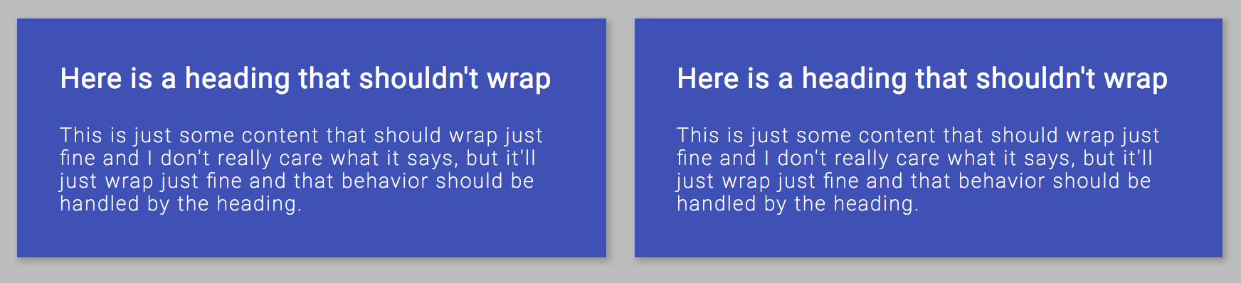
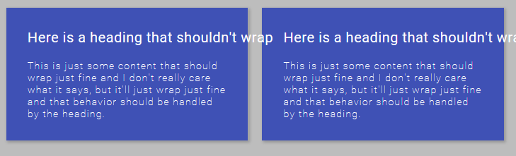
我有一个奇怪的错误,我似乎一直在绊倒,我想知道这里到底发生了什么。我有一个带有两个子 div (flex: 1) 的 flexbox 容器(行换行)。当我有一个我不想换行的标题时(空白:nowrap),IE 11 的包含 div 不尊重它的宽度并缩小到小于标题宽度。这似乎在 Chrome 中工作得很好,但 Safari 和 IE 似乎不尊重标题的宽度。这里发生了什么?
这是 js bin: https ://jsbin.com/bowodiz/edit?css,output
为了方便起见,我将主要样式和标记放在下面。
HTML:
 <div class="flex-container">

    <div class="left">
      <div class="heading">Here is a heading that shouldn't wrap</div>
      <div class="sub-text">This is just some content that should wrap just fine ..</div>
    </div>

    <div class="right">
      <div class="heading">Here is a heading that shouldn't wrap</div>
      <div class="sub-text">This is just some content that should wrap just fine ...</div>
    </div>

</div>
CSS(部分):
 .flex-container {
  display: flex;
  flex-flow: row wrap;
  justify-content: space-between;
}

.flex-container > div {
  flex: 1;
}

.heading {
  white-space: nowrap;
}
期望:
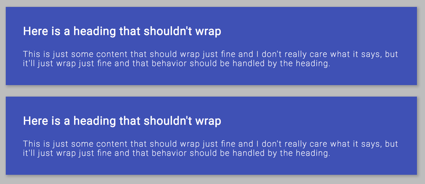
IE/Safari 行为:
原文由 Greg Van Gorp 发布,翻译遵循 CC BY-SA 4.0 许可协议
而不是
flex: 1使用flex-grow: 1; flex-basis: 0;或指定您想要的速记的所有 3 个值。如果您指定flex-basis确保指定一个单位。 https://jsbin.com/ketolifuhu/edit?html,css,输出这是一篇很好的文章,涵盖了一些错误和不一致 https://philipwalton.com/articles/normalizing-cross-browser-flexbox-bugs/