 极客观点
极客观点 项目管理
项目管理 HarmonyOS
我使用 flexbox 属性使我的部分看起来像这样:

它在 Chrome 上运行良好,但我在检查 firefox 和 safari 时注意到了一些差异。
这就是 chrome 的样子: 
但是在 Firefox 上,我无法像红色信号所示那样申请 1% 的保证金:

而在 safari 上,盒子都是一个接一个:
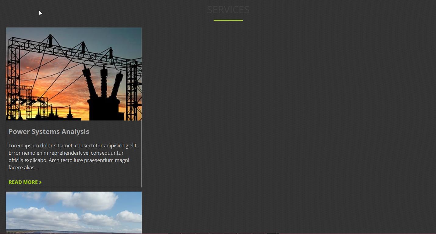
这是一个 WordPress 站点,尚未上线。但这是我的 html 结构:
     <section id="services">

        // here goes the title of the container

        <div class="main-container col-lg">

               // here go all the box

         <div class="services-container">

               // this one of the boxes
         </div>
        </div>
    </section>
和CSS:
 #services {
    background-image: url("img/Services-background.jpg");
    background-color: red;
}
.col-lg {
    display: flex;
    flex-wrap: wrap;
    justify-content: center;
    margin: initial;
    max-width: 100%;
}
.services-container {
    color: #d6d6d6;
    margin: 1%;
    max-width: 100%;
    width: 30%;
}
我怎样才能使它在所有浏览器上工作?
原文由 user agent 发布,翻译遵循 CC BY-SA 4.0 许可协议
我强烈建议你不要使用 flexbox,而是使用 floats。删除你的 css 的所有 flex 属性应该是这样的:
然后你可以添加其余的样式。它适用于所有浏览器。